
Introduction
Dashboard reporting has become one of the most important tools for modern businesses that rely on data to make decisions. Whether you are running a small startup or managing a large enterprise, understanding how to design and use dashboards effectively can significantly improve performance. Dashboard reporting best practices help teams turn raw data into clear, actionable insights that support better decision-making.
In today’s fast-paced digital world, businesses generate massive amounts of data every second. Without a proper system to organize and visualize this data, it becomes almost impossible to understand what is truly happening inside the organization. This is where dashboard reporting comes in. It simplifies complex datasets and presents them in a visual format such as charts, graphs, and KPIs.
However, not all dashboards are effective. Poorly designed dashboards can confuse users, hide important insights, and slow down decision-making. That is why following dashboard reporting best practices is essential for any organization that wants to stay competitive.
What is Dashboard Reporting?
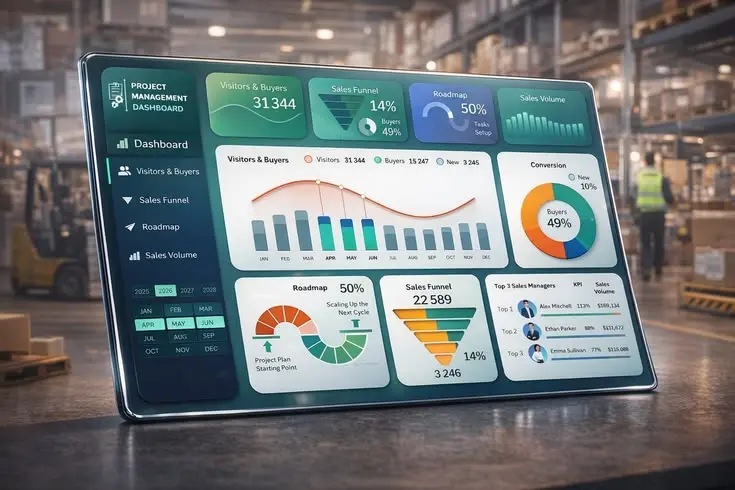
Dashboard reporting is the process of collecting, organizing, and displaying key business data in a visual and interactive format. It allows users to monitor performance metrics in real time and make informed decisions quickly.
A dashboard typically includes key performance indicators (KPIs), charts, tables, and visual summaries that represent data from multiple sources. Instead of going through complex spreadsheets or long reports, users can understand everything at a glance.
Dashboard reporting best practices focus on making these dashboards clear, meaningful, and easy to use. A good dashboard should answer important questions such as:
- How is the business performing?
- What trends are emerging?
- Where are the problems or opportunities?
There are different types of dashboards, including operational dashboards, strategic dashboards, and analytical dashboards. Each type serves a different purpose but follows the same core principle: simplifying data for better understanding.
Why is Dashboard Reporting Important?
Dashboard reporting plays a crucial role in modern data-driven organizations. It helps businesses move from guesswork to evidence-based decision-making.
One of the biggest reasons dashboard reporting is important is speed. Instead of spending hours analyzing spreadsheets, decision-makers can quickly view real-time data. This improves response time and helps organizations stay agile in competitive markets.
Another key benefit is clarity. Data can often be overwhelming, especially when it comes from multiple sources. Dashboards organize this data visually, making it easier to understand patterns, trends, and anomalies.
Dashboard reporting best practices also improve collaboration across teams. When everyone has access to the same data, it reduces confusion and ensures alignment on business goals.
Additionally, dashboards help in performance tracking. Managers can monitor KPIs regularly and identify areas that need improvement. This leads to better accountability and continuous growth.
Without proper dashboard reporting, businesses risk making decisions based on incomplete or outdated information, which can lead to poor outcomes and missed opportunities.
Detailed Step-by-Step Guide
Step 1: Define Your Goals
Before creating a dashboard, clearly define what you want to achieve. Identify key business questions and KPIs that matter most. This ensures your dashboard remains focused and relevant.
Step 2: Identify Data Sources
Gather data from reliable sources such as CRM systems, marketing tools, financial software, or databases. Ensure the data is accurate and updated regularly.
Step 3: Choose the Right Metrics
Selecting the right metrics is one of the most important dashboard reporting best practices. Avoid overloading your dashboard with unnecessary data. Focus only on KPIs that align with your goals.
Step 4: Design the Layout
A clean and simple layout improves usability. Place the most important information at the top and use visual hierarchy to guide the user’s attention.
Step 5: Use Visualizations Effectively
Use charts, graphs, and tables to represent data clearly. For example, line charts are great for trends, while bar charts are useful for comparisons.
Step 6: Ensure Real-Time Updates
Whenever possible, set up real-time or frequent data updates. This ensures users always have access to the latest information.
Step 7: Test and Improve
Regularly test your dashboard with real users. Collect feedback and make improvements to enhance usability and performance.
Benefits of Dashboard Reporting
- Improves decision-making speed
- Enhances data clarity and understanding
- Increases business efficiency
- Helps track KPIs in real time
- Improves team collaboration
- Reduces manual reporting efforts
- Supports strategic planning
- Identifies trends and opportunities quickly
Disadvantages / Risks
- Can become complex if not designed properly
- Poor data quality leads to wrong insights
- Overloading dashboards reduces effectiveness
- Requires regular maintenance and updates
- High dependency on data integration systems
- Can be costly for advanced tools and setups
Common Mistakes to Avoid
One of the most common mistakes is adding too much information to a single dashboard. This creates confusion and reduces usability.
Another mistake is ignoring the audience. A dashboard designed for executives should be different from one designed for analysts.
Many businesses also fail to update their data regularly, which leads to outdated insights and poor decisions.
Using the wrong type of visualization is another issue. For example, using a pie chart for complex comparisons can make data harder to understand.
Lastly, not testing the dashboard with real users often results in poor user experience and low adoption rates.
FAQs
1. What is dashboard reporting used for?
Dashboard reporting is used to visualize business data and track performance metrics in real time for better decision-making.
2. What are dashboard reporting best practices?
They include using clear KPIs, simple design, accurate data, proper visualizations, and regular updates.
3. What tools are used for dashboard reporting?
Common tools include business intelligence platforms, spreadsheet software, and analytics dashboards.
4. How often should dashboards be updated?
It depends on the business need, but real-time or daily updates are ideal for most organizations.
5. What makes a good dashboard?
A good dashboard is simple, focused, visually clear, and aligned with business goals.
6. Can dashboards improve business performance?
Yes, dashboards help organizations make faster and more accurate decisions, improving overall performance.
Expert Tips & Bonus Points
Always keep your dashboard user-focused. Think about who will use it and what decisions they need to make.
Limit the number of KPIs to avoid clutter. Too many metrics reduce clarity and impact.
Use consistent colors and design patterns to improve readability and user experience.
Automate data collection whenever possible to reduce manual errors and save time.
Review your dashboard regularly and update it based on changing business needs.
Finally, always ensure data accuracy, as even the best dashboard is useless with incorrect data.
Conclusion
Dashboard reporting is an essential part of modern business intelligence. When done correctly, it transforms complex data into simple, actionable insights that help organizations grow faster and smarter. By following dashboard reporting best practices, businesses can improve decision-making, increase efficiency, and stay ahead of competitors.
From defining clear goals to choosing the right metrics and designing user-friendly layouts, every step plays an important role in building an effective dashboard. A well-structured dashboard not only saves time but also enhances collaboration and transparency across teams.
However, it is equally important to avoid common mistakes such as cluttered design, poor data quality, and lack of updates. These issues can reduce the effectiveness of even the most advanced dashboards.